Ecoembes Character Illustrations: Recycler Archetypes Campaign
Tipos de Recicladores – Parte 1 (Recycler Archetypes Part I)
This project for Ecoembes involved crafting a captivating series of character illustrations for an Instagram social media campaign. We aimed to playfully represent various recycler archetypes. This, in turn, made the message of sustainability relatable and engaging for a wide audience. Ultimately, the initiative connected with followers personally, encouraging better recycling habits through humor and identification.
Campaign Concept & Goals
The campaign’s heart was a highly shareable five-image carousel. We designed it specifically for Ecoembes’ official Instagram page. Each visual, therefore, was meticulously crafted to be memorable and spark interaction. Indeed, these unique and colorful Ecoembes character illustrations were key to the campaign’s success. They effectively drew viewers in with vibrant appeal and clear messaging.


The Recycler Archetypes
I developed four distinct character archetypes. Each personifies a unique and often humorous recycling habit:
-
- The Perfectionist: This character meticulously folds cardboard until it’s impossibly flat. It showcases dedication (or obsession!).
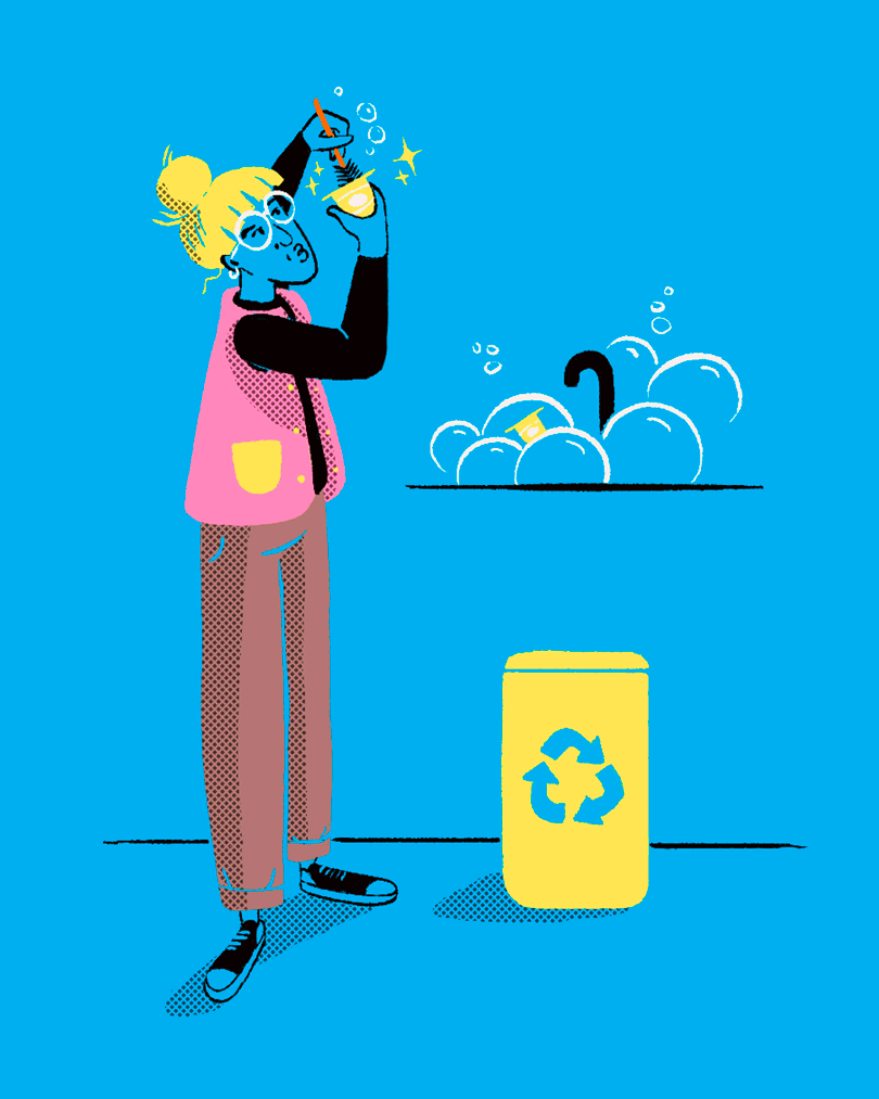
- The Compulsive Washer: This character diligently cleans every container as if destined for immediate reuse. It highlights thoroughness.
- The Skeptic: Shown with a detective’s cape, this character recycles but harbors doubts about its ultimate impact.
- The Frankenstein or Persistent Recycler: This character extends the life of plastic bags. They reuse them until they finally give out, embodying resourcefulness.

Artistic Style & Execution
Moving on to the aesthetics, the artistic approach for this series features expressive, comic-inspired characters. Bold digital black ink outlines bring them to life, thus making colors truly pop. I also used traditional comic shadow textures to add depth and dimension.
Furthermore, I deliberately chose a limited color palette of just six colors. This not only delivers a striking, bold aesthetic; but additionally, it intentionally incorporates non-normative skin tones, promoting inclusivity and visual intrigue within the campaign. This consistent style, consequently, ensures the Ecoembes character illustrations are instantly recognizable across the carousel. It also reinforces the campaign’s brand identity.
Layout & Overall Impact
Finally, beyond the character illustrations, I defined a specific layout. I also chose a typeface that perfectly complemented each character’s unique aesthetic. This ensured the entire visual presentation flowed seamlessly and amplified the core message. These illustrations, therefore, maintain a consistent style, ensuring the campaign’s visual integrity.